|
Infographics |

Infographics are all the rage in marketing circles, but some implementations probably leave viewers in a rage of confusion about what the graphics mean. Identifying a series of datapoints that can visually convey important insights about an important topic takes editorial and design savvy. We’ve seen many examples of pretty pictures with funny data that make no sense and fail to engage the target audience in a meaningful dialogue. Our infographics are designed to achieve our clients’ goal of initiating a dialogue, not just showing off an artist’s imagination.
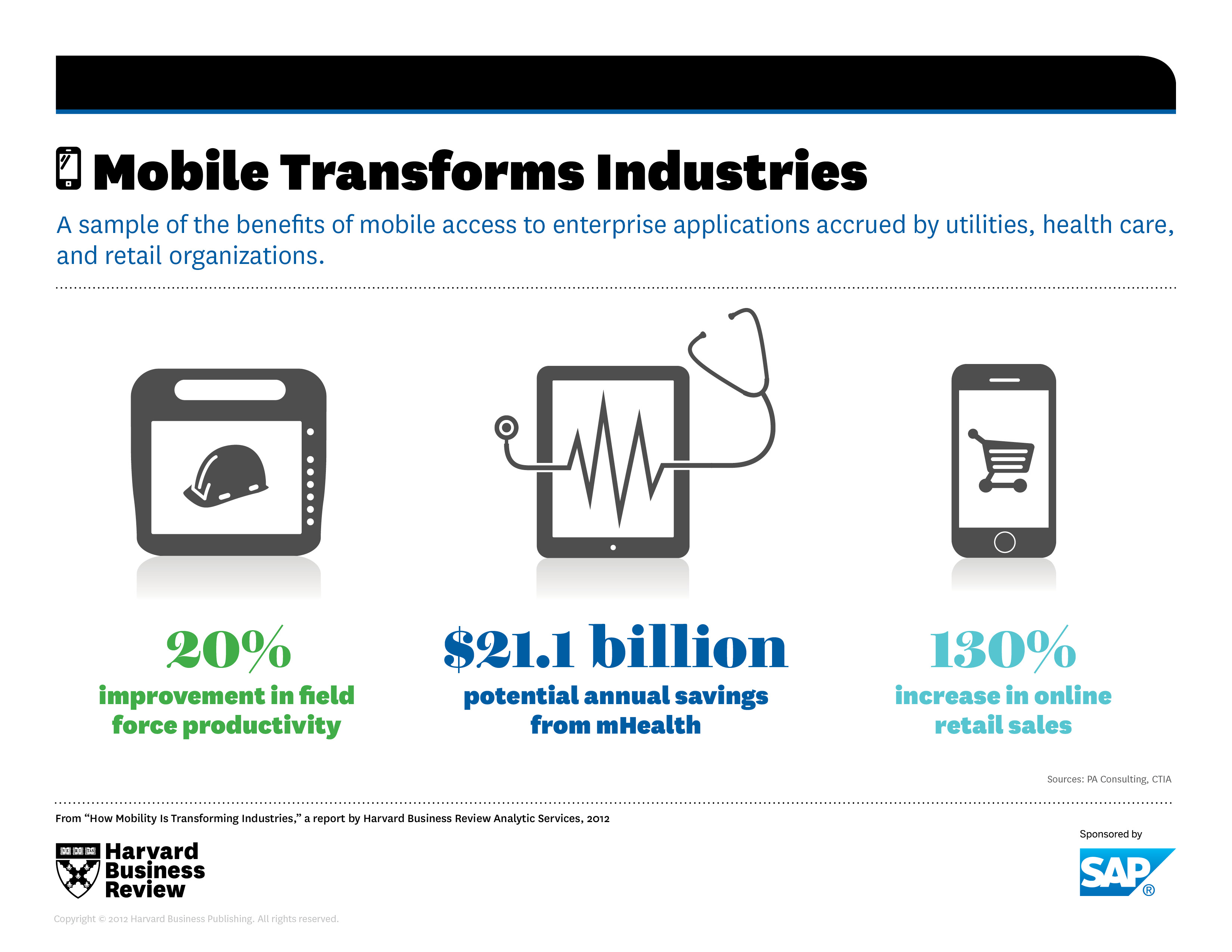
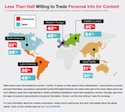
For Harvard Business Review Analytic Services, we identified the most salient data points from survey data and provided guidance about how those datapoints should be illustrated. Here are some samples:
|
(Click to enlarge) |
(Click to enlarge) |
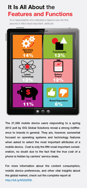
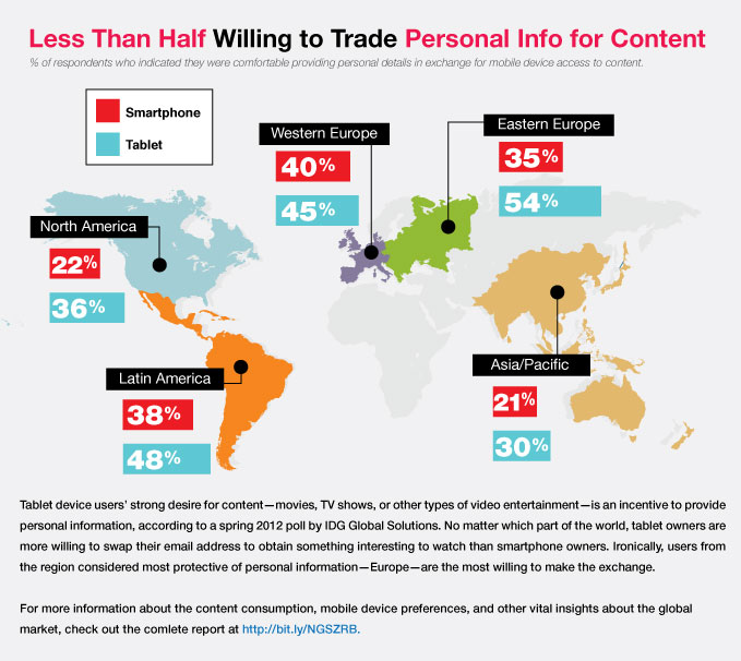
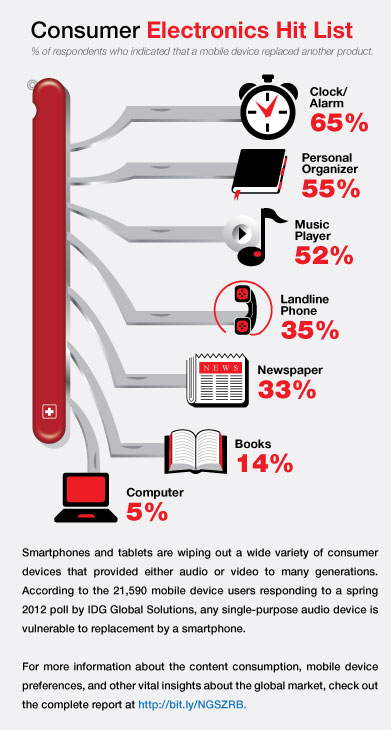
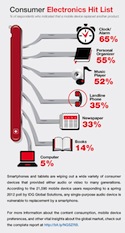
For IDG Global Solutions, we identified the most compelling datapoints from a survey about mobile device use and created a series of infographics that led to extensive discussions with clients and prospects. Here are some samples:
|
(Click to enlarge) |
(Click to enlarge) |
(Click to enlarge) |
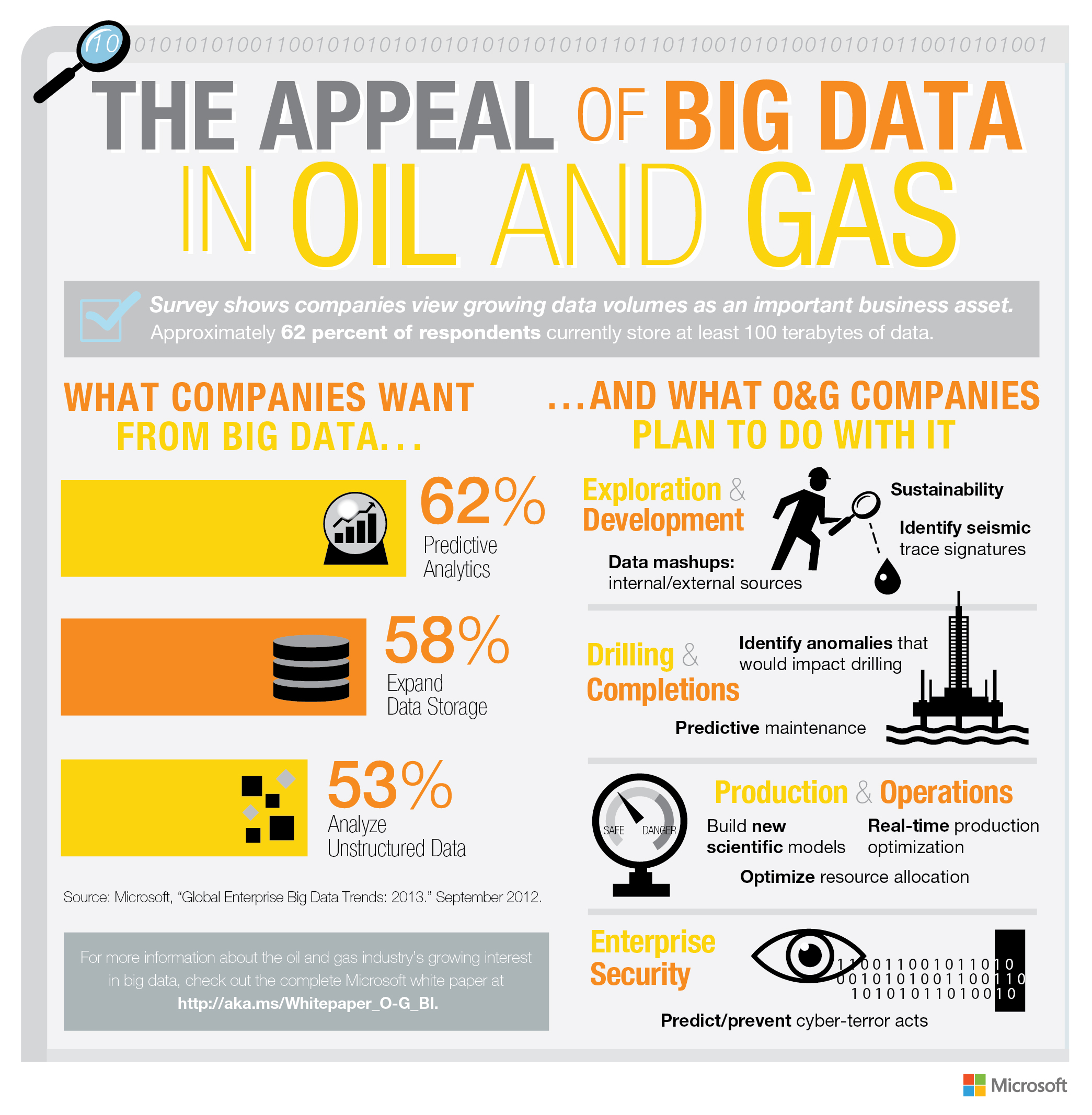
For Microsoft, we identified a number of key points from research and survey data, and then offered guidance on how that information should be illustrated. Here is the infographic:
|